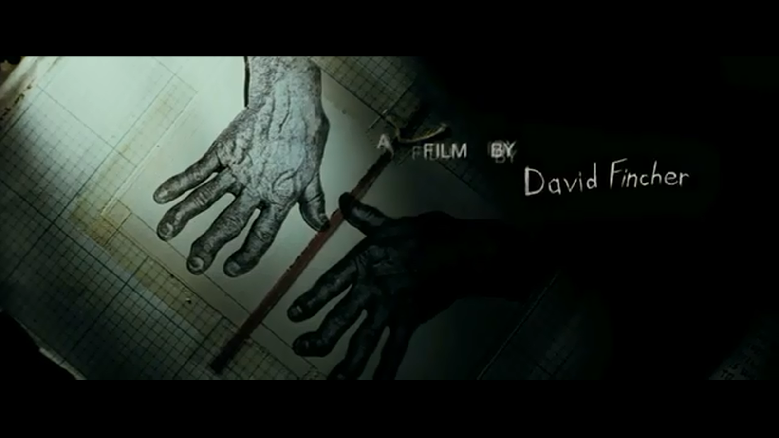
Analyse the title sequence for Se7en.
This title sequence was created by Kyle Cooper and the genre
of this film and title sequence is psychological thriller. The use of weapons and news articles
construct the genre of the film. Also all the pictures that are used suggest
that the villain is doing research. This then can also suggest that he is
educated and is good at planning things. The use of scary music also constructs
the genre of the film because it makes the audience think that the music has
something to do with the film.
 In this title sequence Kyle Cooper has chosen to use close
up shots because it hides the identity of the villain/murderer and makes the
film a mystery. Kyle Cooper also did this because when the film starts
audiences don’t know who is the villain and asks more sense of unknown and mystery
to the film. In this title sequence made by Kyle Cooper, he positioned the
camera so the audience could see what was going on through the murder/villain’s
eye. This would make the audience have an idea on what the film would be about.
Also by using this technique, Cooper isn’t giving anyway any setting or the villain’s
surroundings which therefore creates tension for the audience. All the props and objects that are used in
this title sequence are shown very close up and take up most of the frame. Also
by doing this it creates suspense as the audience don’t know who is using these
props which are another reason why Cooper positioned the camera in the villain’s
view so it wouldn’t give away the identity of this character. In this title
sequence, most of the shots that are used are dark which has attached to it
dangerous connotations. Most colours that are used in this title sequence are
either black or white which gives the title sequence a darker film but also
suggests to the audience that these are the colours that may be associated
throughout the film. The producers of this film also chose an eerie soundtrack
to go along with the title sequence because they perhaps wanted the audience to
attach this song to the film. Many of the tasks that the villain does in this
title sequence aren’t in order which may suggest that he is doing a lot of
things at once meaning he could be an educated person. Also throughout the
whole title sequence location or the identity of the person isn’t revealed
which adds even more tension to the film because all of this stays a mystery to
the audience. Cooper has chosen to use two different types of fonts because he
may have wanted the audience to believe that there are two sides of character
to the villain in this film. In this title sequence, Cooper provides the
audience with a lot of information like he is a potential killer or already is
one. Also in one part of the title sequence, the audience sees the villain cut
off his fingerprints so no one can trace which may suggest that he is educated
Add more pictures - closer analysis using micro and macro
ReplyDelete