Friday 30 January 2015

Stanley Kubrick - the title sequence designer

I am looking at Stanley Kubrick because he did the title sequence for The Shining and this film is a similar genre to the one I am doing for my film. This film is a physiological/crime film which is what genre my film is going to be.


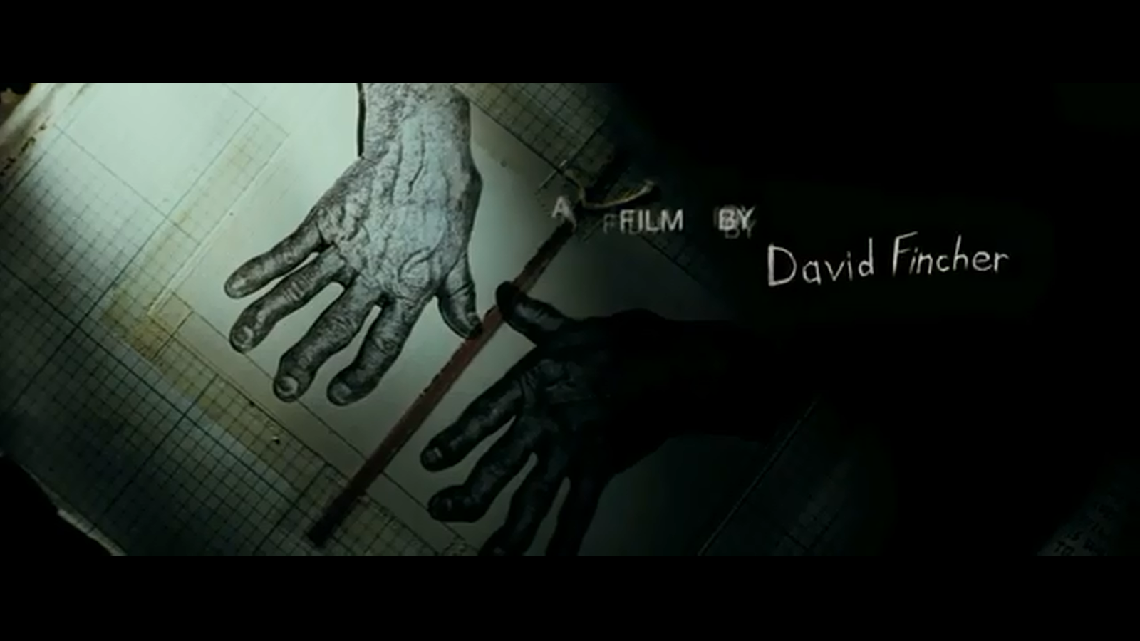
This is the title sequence for The Shining. Stanley Kubrick wanted to establish an ominous mood whilst the character was driving up the hotel. The vast isolation of mountains and winding roads create a feeling of mystery for the audience. There is an extreme long shot of the settings to show the audience where the film is taking place. Also, Kubrick shows isolation in the nature which could represent isolation and no one being around. Throughout the title sequence, the mountains are always seen in the shots which could suggest to the audience that this will be a key location throughout the film. Kubrick uses a high angle shot to show the car driving alone on an empty and by using this angle the car looks smaller compared to the surroundings. Throughout this title sequence, the settings stay the same which could suggest to the audience that isolation will be a key theme throughout this film. In the title sequence, the music is played throughout in the background which adds tension to the film for the audience. As the main focus is on the location, it gives the audience an idea of where the film is going to be taking place.

About Stanley Kubrick-

Stanley Kubrick was an American film director, screenwriter and producer who was born on July 26 1928 and died on March 7 in 1999. He worked mostly in the UK. He is regarded as one of the greatest and most influential directors of all time. Typically, his films were adaptations of novels or short films, his films were described as having unique cinematography and his attention to detail in realism. Most of his films covered a variety of genres which included war, crime, romance, horror and science fiction.

Wednesday 28 January 2015

What the coursework is about?

What the coursework is about? 

The coursework that has been set is to make a title sequence for a genre of film. We then have to blog post everything that we do which includes our research evidence, the planning and filming and the evaluation once we have filmed. In these posts I am going to be looking at different title sequences and ones that are similar to the genre that my group has chosen which is crime/psychological and mystery. I will also be researching into different title sequence designers and especially looking into ones that fit with my genre that I have chosen for my film.

What is STINCS?

What is STINCS?

Setting - where the film is set and takes place

Theme - genre of the film 

Iconography - the visual elements that portrayed in the film 

Narrative - the story line or the plot

Characters - main characters in the film but also minor characters 

Style - the way the story is put together

Applying STINCS to our film:

Setting - The film is going to be set in various locations. Like Canada when they go on holiday. The fair when they are tracking down the son and twin brother. Also a local house in America where the family lives.

Theme - the genre of our film is crime/mystery/physiological

Iconography - the visual elements that will be portrayed in our film will be bones (the six small bones), blood, fire and police tools like torches etc.

Narrative - the story line for our film is that a boy goes missing, but his dad's twin brother has taken him. The twin brother has left six small bones to make it look like the boy died. The police and mum try to find both the boy and twin brother. They find both of them and take the twin brother to be questioned. The audience will see the twin brother being questioned but they won't hear any of his responses and the film ends.
Characters - we have two main characters in our film. They are Leonardo DiCaprio which plays the twin brother and Paul Dano who plays the police officer. We haven't decided on who will play the mum and the missing boy in the film.

Style - we have used Todorov's theory to put our film together.

Todorov Theory

In 1969, Todorov created a theory that he believed could be applied to any film. He believed that all films followed the same narrative pattern. He believed that they all went through the stages called the equilibrium, disruption and the solution which is also known as the new equilibrium.

There are five stages the narrative or story line can go through which are:
  • Equilibrium (the start of the story, everything as it should be) 
  • A disruption of that order by something that happens
  • The narrative recognises something has happened. 
  • There is an attempt to repair the damage of the disruption
  • A return of a new equilibrium
In my group we applied this to our own narrative: 

Equilibrium 
  • The audience will see a funeral taking place, it will be a father that has died, the family go on holiday in Canada. The sons goes to look around the area and he is gone for more than two hours. 
Disruption
  • The mum goes out to look for him. They can't continue as they have found a forest fire, there is no sittings of the boy named Morgan. Missing posters are put up, they find six small bones but they have no fire damage on them. The fathers twin brother dug them up from another child's grave to make it look like Morgan died. At this point, the audience don't know where the bones have come from and don;t know of the twin brother. Rose sees a picture of Morgan and a man who she believes is her husband. They go to the fair straight away because that is where the picture was taken. 
Resolution
  • The man in the newspaper doesn't have a scar under his eye like her husband does. Calls the police and asks them to see if her husband really did die, during their searches they find a man that looks similar to her husband and who has the same birthday. Eventually track the twin brother down and take him to the police station to be questioned. The film ends with the audience seeing the twin brother being questioned but you won't hear his response. Meaning there is no resolution to the story.
Another theory that I will look at is Vladimir Propp's character theory. Propps was a Russian theorist who studied fairy-tales and folklore. He identified plot elements and developed this into an 8 spheres of action narrative theory. He developed a character theory for studying media texts and productions and this indicated that there were 7 broad character types in the 100 tales he analysed which could be applied to other pieces of media. There 7 character types were: 
  1. The villain - they struggle against the hero 
  2. The donor - they prepare the hero and give the hero something to help them on their quest/journey
  3. The helper - they help the hero in the quest 
  4. The princess - person he hero usually marries or they are a love interest for the hero
  5. The false hero - they are seen as good at the beginning but then emerge as evil 
  6. The dispatcher - the person who sends the hero on their quest
  7. The hero - they are either the victim/seeker/winner - they react to the donor and get their love interest which could be seen as a reward for them fulfilling their quest/mission
When planning our title sequence and film, we used Propp's theory: 
  1. The villain - Leonardo DiCaprio - he kidnaps the child 
  2. The hero - Paul Dano - he is the police officer and helps the family find their missing son
  3. The donor - Courtney Cox - she helps the hero find her son because she gives him information which helps his case
As our film doesn't need a lot of characters in it we wouldn't fully apply Propp's theory to our film but if we were to re-think the cast we could fully apply Propp's theory and have all 7 character types. 

Monday 26 January 2015

Film Pitch in front of class and feedback.

Today in our media lesson Hannah and I pitched our film idea to the class and our teacher. The feedback that we got were both negative and positive. Many people liked our film title but didn't like all the writing that we had on each slide and they wanted us to use more pictures to explain things. This was the opening slide for our presentation and many people liked the concept of the flames because it refers to something that happens in the film.

Below are feedback sheets that all the class were given when we were doing our pitch. Most people thought that our story was very detailed and they understood why we chose to rate our film a 15. Many people thought that a simple breakdown of the narrative was something that needed to be developed in our pitch. They also wanted us to reconsider the characters that we were using in our film. This is because most of the class thought that Leonardo DiCaprio should be playing a main character and also they couldn't understand who our main character was and wanted us to develop on that more. Also the class wanted us to expand on the research that we did for the films that were similar to our genre and that influenced us. They want us to do a slide for each film that influenced us to create this film. For example we looked at two films which were called Prisoners and Taken. Also the feedback we got explained that we need to re-think our budget and gross profit for our film as we have Leonardo DiCaprio in our film. We also need to add more information about the film studio we have chosen to produce our film.

Below are feedback sheets that all the class were given when we were doing our pitch:


Sunday 25 January 2015

The presentation for my group's pitch.

http://www.slideshare.net/zarabhana/pitch-for-media-43879287

This is the presentation for my groups pitch on our film. In this PowerPoint we explain what our film is about, our target audience and who will star in our film. These are screenshots for our pitch for media. Once we showed this to our media class, they gave us feedback and we have to change our presentation according to the feedback we got. We will be pitching our film again on Monday again.


Wednesday 21 January 2015

Planning for our film


This is a picture of my groups planning for our title sequence. As you can see we have decided the whole narrative for our film. We have also discussed the target audience for our film and the genre of our film. Tomorrow we will discuss what actors and actresses we want to star in our film. We have also decided our film name which is 'six small bones', we have decided on this title because it links with some of the things that are discovered in our film. Tomorrow my group will be planning a PowerPoint that we will need to do for a pitch that we are going to do for our film. We also discussed today that the font we are going to be using is going to look like bones because it fits in with our title.

Continuity sequence

This is our continuity sequence that we did at the beginning of the year.

General research into title sequences

General research into title sequences (codes, conventions, purpose)

In this blog post, I am going to be discussing the codes, conventions and the purpose of title sequences.

The purpose of an title sequence is to establish the mood and visual character of a film and introduce the viewer to all or some of these elements. These elements are characters, locations, the narrative of the film, the themes and the genre. The aim of the title sequence is to establish these elements of a film. During a title sequence, the audience will be introduced to the director, producer, the actors that star in the film and most important the title of the film. The purpose of a title sequence is to give little clues to the audience about what the film may be about so they are intrigued and want to watch more. Title sequences usually hint to the audience what the film will be about and they are a powerful expression of motion graphics. A main function of a title sequence is to set the tone of the film that the audience is about to watch and by watching a title sequence, the audience gets a sense of the genre just by watching the first seconds of a title sequence. Most effective title sequences engage the audience into the film that they are about to watch by hinting at some of the themes and topics that may be shown in the film. The title sequence may also reveal some main characters to the audience. The aim for title sequences is to build anticipation, buts sometimes they reveal the main character's personality. Also there could be an enigma that is built in the title sequence as audiences will want to know if it gets solved. The creator of any title sequence must visually capture the essence of the movie. Some of the following elements are things that both a designer or animator will have to keep in mind when creating a title sequence:

  • typography (font)
  • textures 
  • lighting
  • camera/movement style
  • editing
  • techniques/styles
  • imagery

Analysing title sequence for 'The Game'

Analyse the title sequence for 'The Game'.

I wanted to look at this title sequence as another one to base my work around. in the opening part of the title sequence the background and the writing dissolves into puzzle pieces which cold suggest that this film is going to be a mystery and also the puzzle pieces represent a game which is the title of the film. Throughout this whole title sequence there is no dialogue and there is only music which adds mystery to the film as the audience doesn't know what is going to happen and they don't know the characters yet. There are a lot of references to water in this title sequence which could foreshadow what is going to happen later on in the film. For example, the audience sees a shot of 3 sail boats on the water and then the audience sees a man giving a young boy a sail boat. this then suggests to the audience that they could have some connection. Also further into the title sequence, the audience sees a young boy getting pushed into a swimming pool by his friends which could foreshadow later events that will happen in the film. The audience could assume that this whole title sequence is a flash black of the young boy that the audience lasts sees at the end of the title sequence. The title sequence then cuts to present day of the young boy grown up washing his face with water. This is another part of the title sequence where water is referred to. The audience could also assume that the grown man that they see at the end of the title sequence is the same boy that we see in the title sequence. The audience could suggest that it is this young man's birthday when he is having flashbacks but it is also his birthday when the title sequence ends in present day.

Kyle Cooper presentation

This is my power point presentation on Kyle Cooper the title sequence designer. I decided to do some research on him because he is one of the people I was influenced by when thinking about our title sequence. As a title sequence designer, he relates to the genre that we are basing our film around because he has done both horror/crime and physiological and this is what genre we want our film to be. I have looked at his title sequences to get an idea of how he included these elements in his own title sequences.


Research evidence - looking at Sinister and Taken title sequences

Research Evidence: 

For our main task, we are going to create a title sequence for a crime/horror film. I am going to look at Sinister and Taken. From the information that I gather from these films I will be able to get ideas to put into my own film sequence and may be able to base my title sequences on these films.

The first film that I am going to research into is Sinister which is a Crime/Horror. First of all I looked at this title sequence and what I liked about it was that they used different types of books and filmed it which created a good impact. Also I liked the music that they used for it and I think when creating my title sequence I should pick the right music because it would create a good impact on my title sequence. The music that you use when creating a title sequence has to be effective because you want the audience to recognise the film when they hear this music. This film is about when a crime writer moves him and his family into a house where a horrific crime took place earlier but his family doesn't know this and he is the only one that does. He has moved into this specific house because he wants to find out more about the crime so he can write a book about it to make his career better. Whilst moving in he finds film footage to help him with his research but he soon discovers a figure in each of the films. Then from this point, his family start to suffer as well as him and this leads the audience to think will they survive in this house. I looked at this title sequence because I liked the way that they filmed it as it looked very old fashioned and that is something that I want to co-operate into my own idea.


The second film that I am going to research into is Taken which is a Crime/Thriller. I first looked at the title sequence of this film and throughout the whole title sequence it filmed a skyline which could suggest to the audience that the film is going to be set in a city. Also the buildings that were in the skyline were red and put against a black back drop. When people were watching this film and saw this title sequence they could suspect that red meant blood and could suspect that this film would be gory. What I liked about this title sequence was that it was simple but it was effective. It also gave clues as to what the film would be about and also straight away the name of the film was introduced and the stars that would be appearing in it. Also the music that they used was effective and is went with the whole idea of the film. This film is about a retired CIA agent that has to travel to Europe because his daughter has been kidnapped whilst on trip to Paris.


I chose these two films to look at because the genre of my film is both crime and thriller and both of these films incorporate these two genres. I looked at Taken 2 because it is about a girl that goes missing and my group's plan for our film is to make it about a boy that goes missing on holiday with his family. I also looked at Sinister and its title sequence because it is about a crime that took place at a house and I wanted to look at this title sequence to get some inspiration and to see how they filmed it.

Thursday 15 January 2015

Analysis of Zombieland title sequence

Analysis of Zombieland title sequence
 In this title sequence, there is a contrast of two genres which are horror and comedy. These are both portrayed in the title sequence because the producers of the film wanted the audience to know that these are the two genres that the film will revolve around. Throughout the title sequence the audience sees that mostly everyone in the city/town has turned into a zombie which suggests that no one has been left out in this zombie apocalypse.
Zombieland


By audiences watching this title sequence they will understand that there will be a lot of gore surrounding the film as there are zombies involved. In this title sequence, audiences see a lot of gore and blood which they could associate with horror films so they would know what to expect. In this title sequence there is no difference with lighting and the lighting is natural because of where it is being filmed so it gives the film a sense of realism. The slow motion shots that are used are there to make an impact because they are meant to be scary but also make the title sequence funnier and tenser. This then tells the audience that the film is a comedy horror. The editing that is used in this title sequence are quick cuts which also show a sense of realism because these quick cuts represent the rush that each of the characters in the title sequence are in. The font that is used in this title sequence is coloured dark red which could have the connotations of death and blood. This then tells the audience that this film will probably consist of these two things. The producers of this film chose to have the text shattered throughout each attack because they wanted the audience to know that the film will be about the disruption of normality as a zombie apocalypse isn’t something that happens every day. During this title sequence an enigma is created because the audience are curious as they want to know if the humans will overcome the zombies. This then results in the audience wanting to watch the film as they want to know what happens. Also in this title sequence irony has been used to start up the humour in the film because a man wearing a ‘the end is near’ sign is attacked by zombies. This suggests to the audience that the film will contain a humorous element to it. It also suggests that this film won’t be a typical zombie film and won’t just contain elements of horror but will also contain elements of comedy. Whilst this man is getting attacked, there are two people in the background that run off which could suggest that in this film everyone doesn’t care about each other and they only care about their selves. But it also shows to the audience that the characters in this film have lost hope and they are just desperate to survive and don’t care about anyone else. 

Analyse the title sequence for Se7en

Analyse the title sequence for Se7en.

This title sequence was created by Kyle Cooper and the genre of this film and title sequence is psychological thriller.  The use of weapons and news articles construct the genre of the film. Also all the pictures that are used suggest that the villain is doing research. This then can also suggest that he is educated and is good at planning things. The use of scary music also constructs the genre of the film because it makes the audience think that the music has something to do with the film.


In this title sequence Kyle Cooper has chosen to use close up shots because it hides the identity of the villain/murderer and makes the film a mystery. Kyle Cooper also did this because when the film starts audiences don’t know who is the villain and asks more sense of unknown and mystery to the film. In this title sequence made by Kyle Cooper, he positioned the camera so the audience could see what was going on through the murder/villain’s eye. This would make the audience have an idea on what the film would be about. Also by using this technique, Cooper isn’t giving anyway any setting or the villain’s surroundings which therefore creates tension for the audience.  All the props and objects that are used in this title sequence are shown very close up and take up most of the frame. Also by doing this it creates suspense as the audience don’t know who is using these props which are another reason why Cooper positioned the camera in the villain’s view so it wouldn’t give away the identity of this character. In this title sequence, most of the shots that are used are dark which has attached to it dangerous connotations. Most colours that are used in this title sequence are either black or white which gives the title sequence a darker film but also suggests to the audience that these are the colours that may be associated throughout the film. The producers of this film also chose an eerie soundtrack to go along with the title sequence because they perhaps wanted the audience to attach this song to the film. Many of the tasks that the villain does in this title sequence aren’t in order which may suggest that he is doing a lot of things at once meaning he could be an educated person. Also throughout the whole title sequence location or the identity of the person isn’t revealed which adds even more tension to the film because all of this stays a mystery to the audience. Cooper has chosen to use two different types of fonts because he may have wanted the audience to believe that there are two sides of character to the villain in this film. In this title sequence, Cooper provides the audience with a lot of information like he is a potential killer or already is one. Also in one part of the title sequence, the audience sees the villain cut off his fingerprints so no one can trace which may suggest that he is educated

Analyse the title sequence for splice

Splice is a sci-fi thriller by Vincenzo natal about two successful young genetic engineers who experiment with humans and animal to create a DNA superior creature. The term 'splicing' means to combine segments of DNA to form a new genetic combination. This title sequence portrays through the visual effects that they include in the title sequence. In some aspects the title sequence relates to the film because it shows DNA combining which creates a chilling effect for the audience. The use of dark lighting and blurriness is used in the title sequence to make it unclear to the audience what is lurking in the waters. The typography that is used in this title sequence imitates the veins that are on the creature and this gives the audience an idea of the narrative and creates an eerie atmosphere. I like how the x-rays of the animals change into  the companies logo. This part suggests to the audience that the film is going to be a horror film and they should suspect more things like this. The music that is used in this title sequence is eerie which adds to the whole atmosphere that the title sequence creates. As the title sequence goes on, the pace gets quicker and so does the music that is used which is parallel to what is happening on screen. From this title sequence the audience begins to understand that the character isn't a person but is a creature. The audience can understand this from all of the features in the body that aren't normal. For example, the scales, the veins popping out and dark colour of the skin.

The genre of this film is a horror/thriller and the conventions of this genre is: 

  • Setting - isolate places, small communities, dark streets and alleyways. 
  • Iconography - dark colours like red or black - this links to blood/evil. 
  • Narrative - there is a classic narrative structure 
  • Characters - the hero (protagonist), a man or 'final girl' for the film, police officers (good or bad), the villain (monster, freak, alien or serial killer. 
  • Themes - religion, childhood, beyond death, supernatural, nightmares. 


Saul Bass and his work with title sequences

Saul Bass and his work with title sequences-

I chose to research into Saul Bass because I wanted to see the design that his title sequences incorporated and wanted to see if I could incorporate his designs into my groups title sequence. Even though some of his title sequences aren't the same genre as mine, I wanted to add some elements of his title sequence into my groups.

Saul Bass was an American graphic designer who was born on May 8 in 1920 and died on April 25 in 1996. He was best known for his design of title sequences and film posters. During his 40 year career he worked for some of Hollywood's most famous filmmakers like Alfred Hitchcock and Stanley Kubrick who did the title sequence for The Shining. One of his most famous title sequences was The Man with the Golden Arm which was a American drama film that was based on the novel by Nelson Algren. Bass designed some of the most iconic corporate logos in North America which included the Bell System logo in 1969. He also designed the Continental Airlines' 1968 jet stream logo and it became one of the most recognized airline logos during this era. When working with Alfred Hitchcock, Bass provided him with effective and memorable title sequences. This work made Bass a revered graphic designer. Bass described his main goal for title sequences was to 'try to reach for a simple, visual phrase that tells you what the picture is all about and evokes the essence of the story.' Bass also described that another thing that influenced his title sequences was the goal of getting the audience to see familiar parts of their world in an unfamiliar way. Bass designed title sequences for more than 40 years and had diverse film making techniques. He also did live action opening title sequences which were often prologues to their films and then transitioned smoothly into the opening scene of the film.

Towards the end of Bass' career, he was rediscovered by Martin Scorsese and James L. Brooks. With Scorsese, Bass created title sequences for Goodfellas (1990), Cape Fear (1991)and Casino (1995) which was his last title sequence. He then worked with Scorsese again in his career and this work saw him move away from the techniques that he had created and he moved into the use of computerized affects. His new title sequences featured new and innovative methods of production and graphic design. Most modern title sequences that introduce the mood or theme of a film can be seen as a tribute to Saul Bass' innovative work. many title sequences that have a setting during the 1960s have used Bass' graphic style of his animated sequences from that era. Some examples of films that adapt bass' techniques are Catch Me If You Can (2002) and X-Men: First Class (2011).